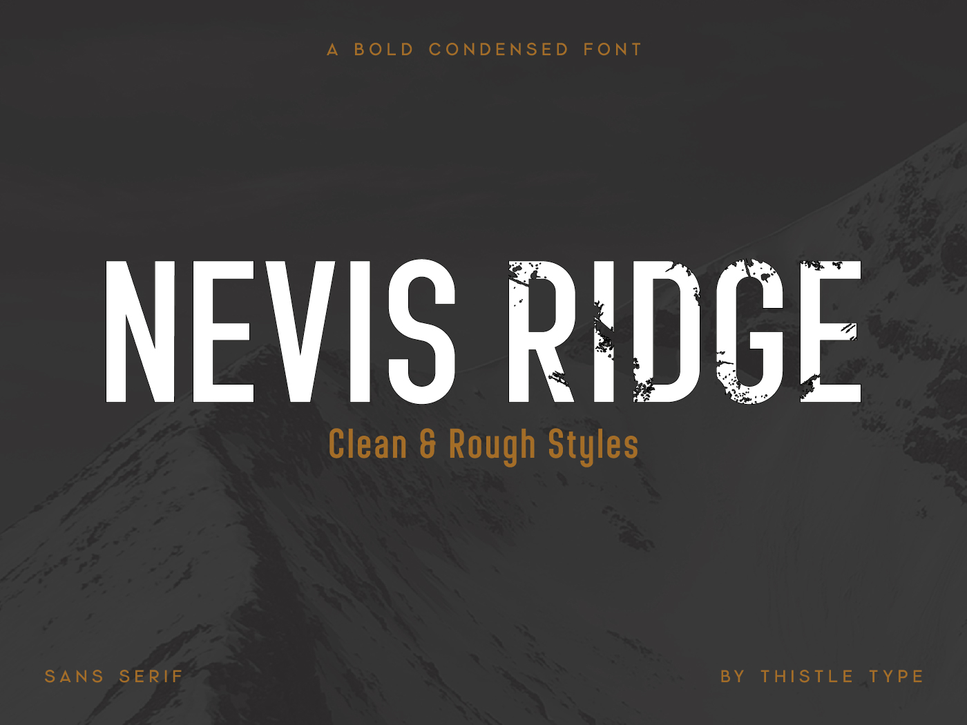
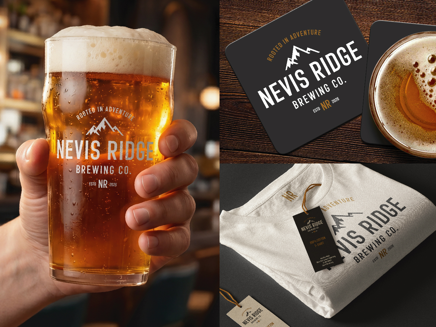
Nevis Ridge is a bold, condensed display font inspired by the rugged ridgelines of Ben Nevis. Shaped by stone, wind, and altitude, it’s built to feel strong, compact, and full of character.
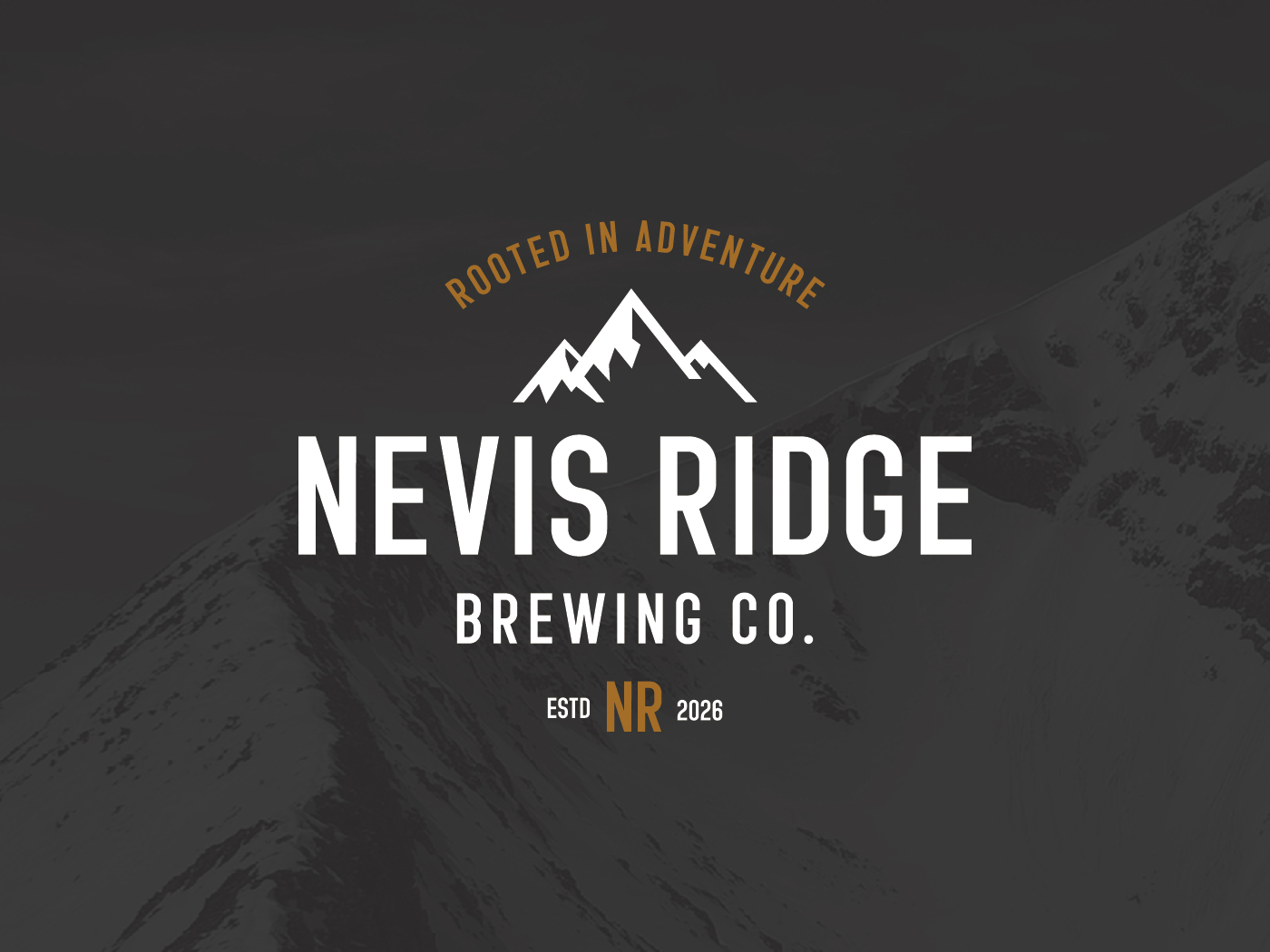
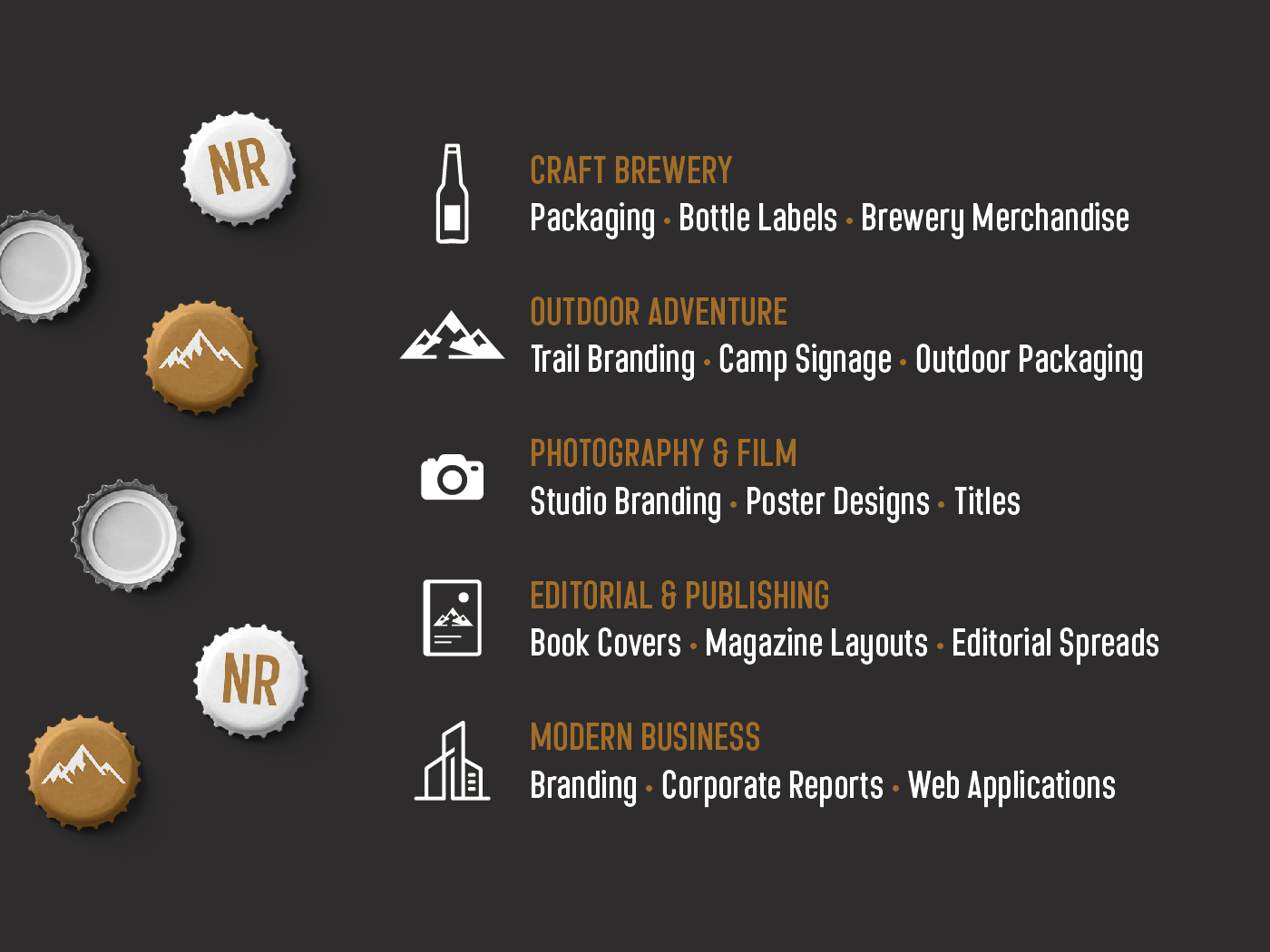
It works well when space is tight but impact still matters – ideal for logos, posters, packaging, and headlines that need to feel powerful without taking up too much room. The condensed proportions keep things sharp and efficient, while still holding plenty of presence.
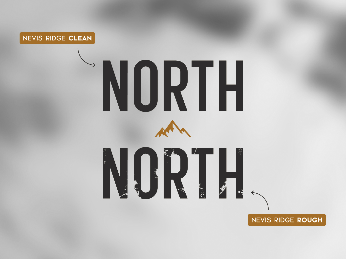
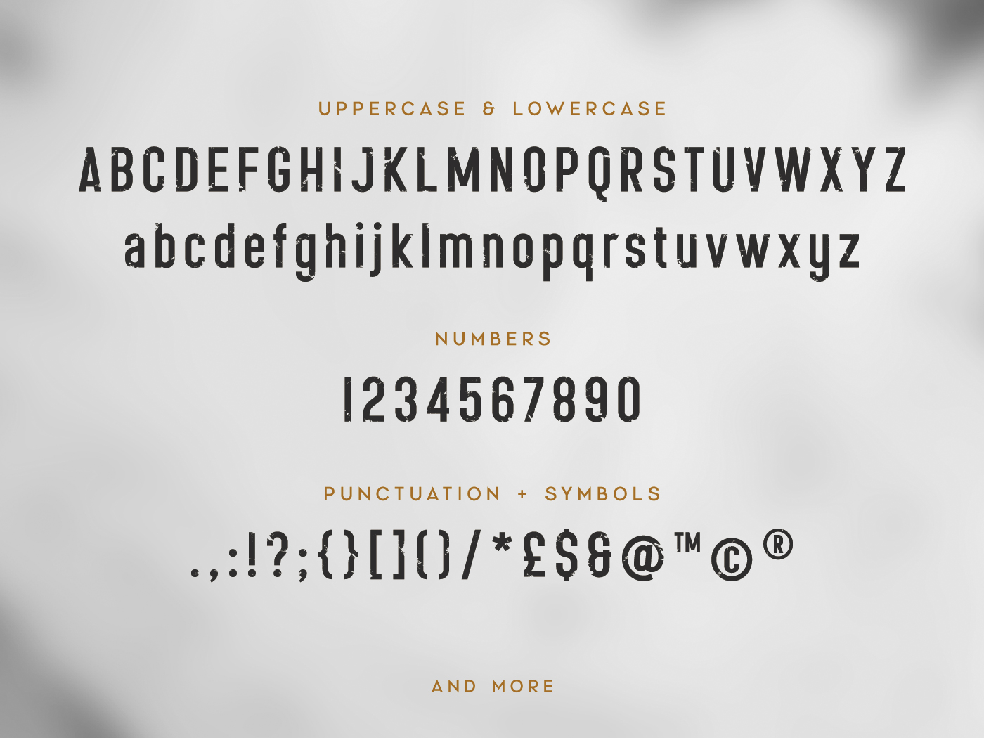
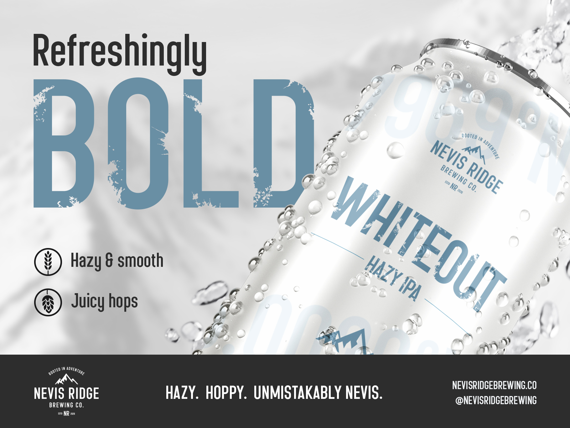
Alongside the clean style, Nevis Ridge also includes a Rough alternate, adding grit and texture when you want something a bit more raw and expressive. Both styles are included as a family package, giving you flexibility from clean and controlled to weathered and bold.
Why choose Nevis Ridge:
- Strong condensed design that works well in tight spaces
- Built for impactful logos, headlines, and packaging
- The Rough alternate allows for a more textured, expressive feel
- Gives you both clean control and a more rugged option in one family
- Designed to hold character even at large display sizes
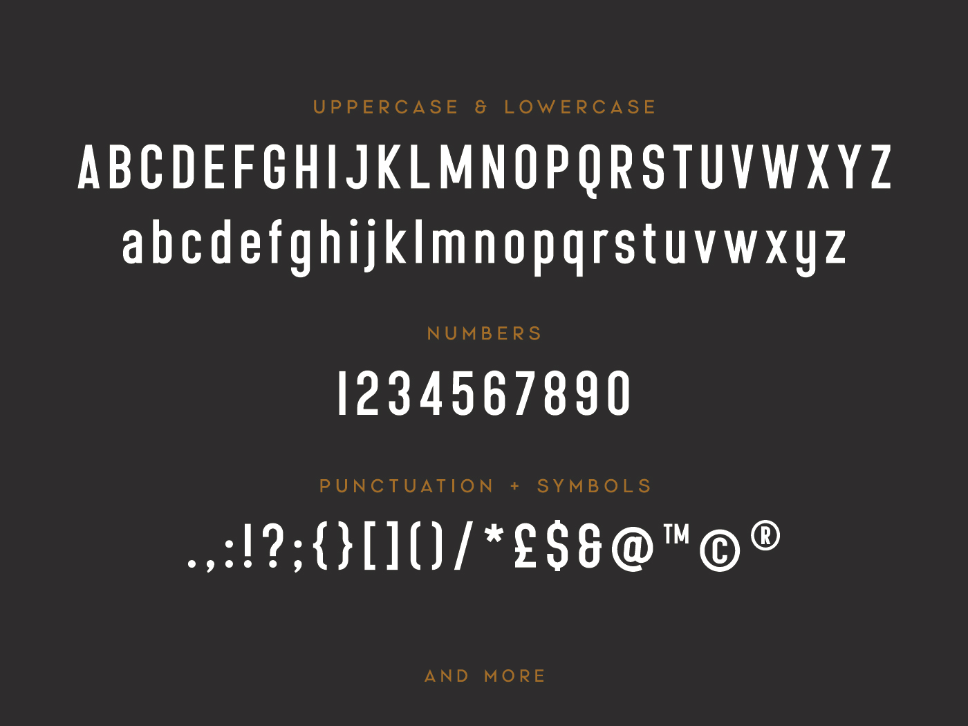
- Includes uppercase & lowercase characters, numerals, punctuation, and symbols
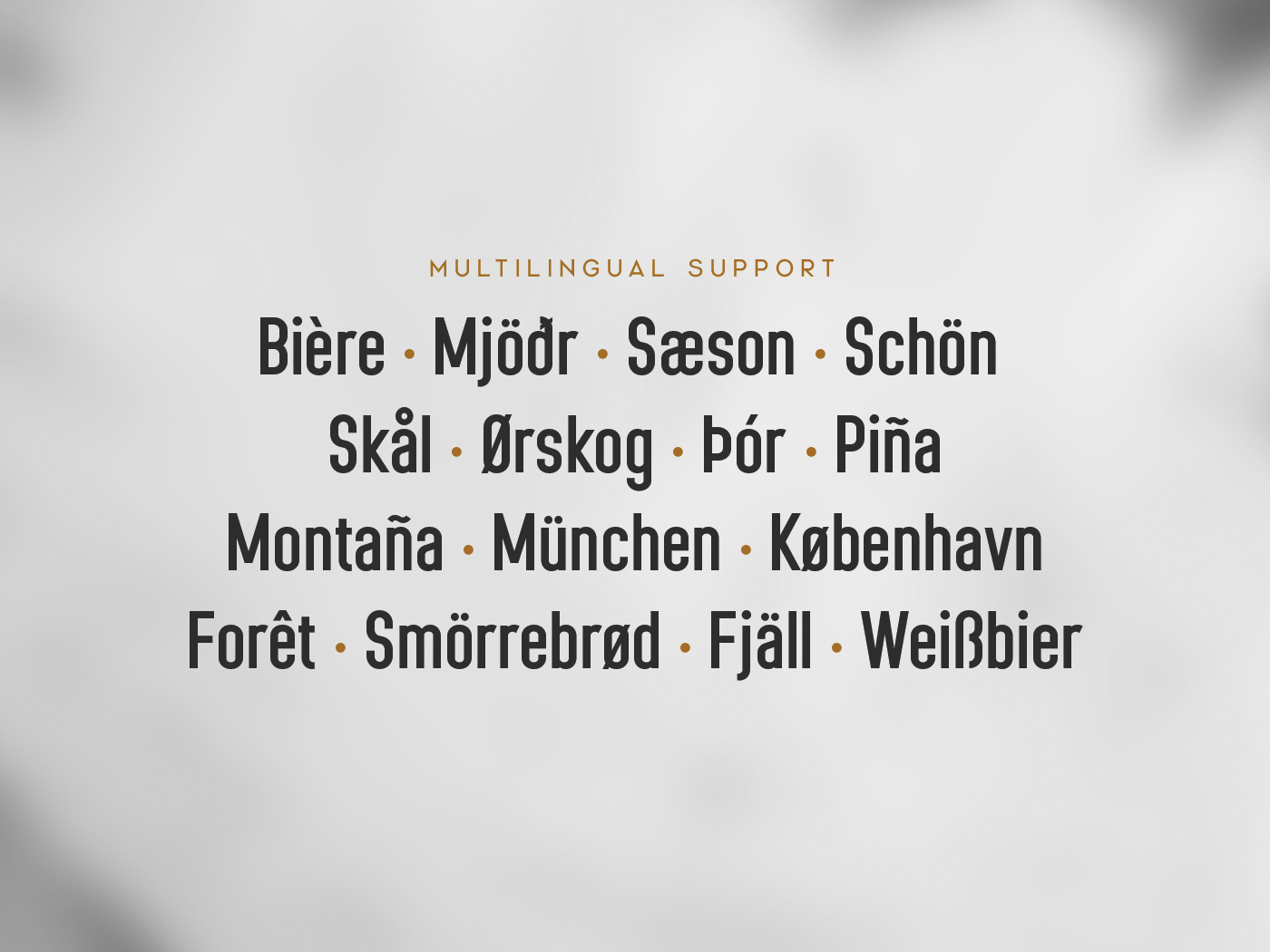
- Multilingual support for European languages