Inspired by the dramatic ridge lines of Ben Nevis, Nevis Ridge is a condensed display typeface that captures a real sense of altitude in its letterforms. Tall, confident, and designed to stand its ground – much like the landscape that influenced it.
Clean or Rough – You Choose the Terrain
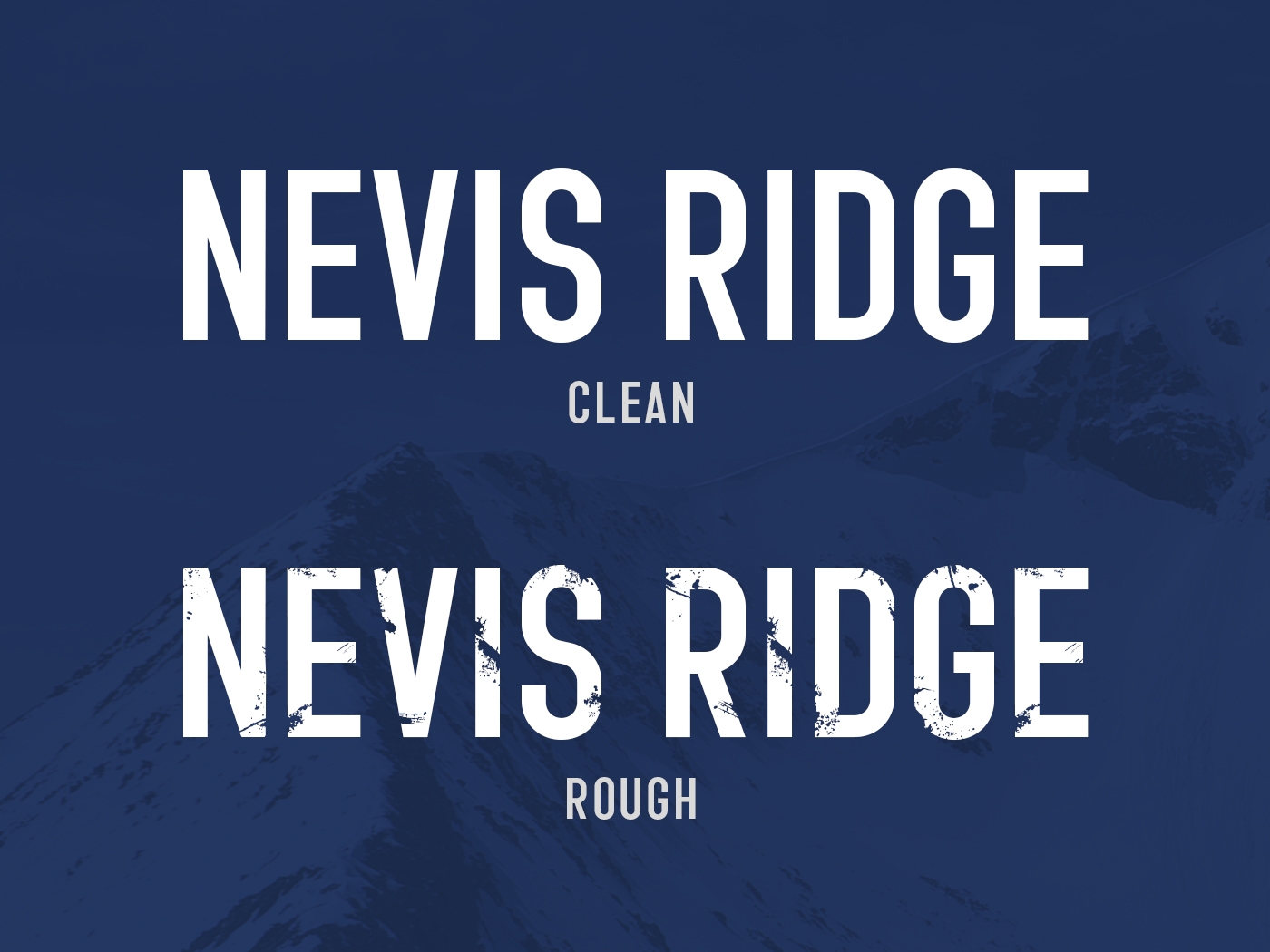
Nevis Ridge comes in two styles: Clean and Rough.
The Clean style is crisp and modern, with sharp edges and confident simplicity. It works beautifully for branding projects, editorial headers, or signage where clarity really matters.
The Rough style introduces texture and grit. It feels wind-weathered, like stone shaped by time. The detailing adds character without overwhelming the letterforms, making it ideal for projects that need warmth, authenticity, or a slightly handcrafted edge.
Used together, the two styles give you plenty of flexibility. You can keep things refined, lean into the rugged look, or mix the two for contrast.
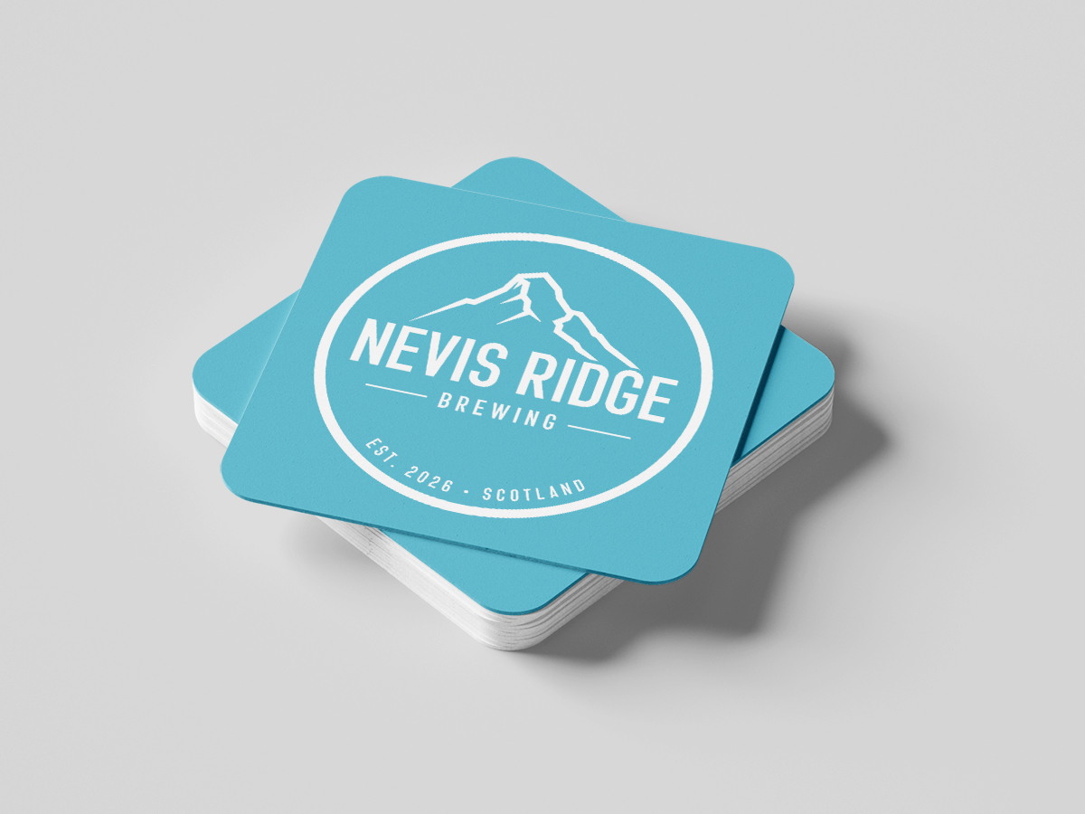
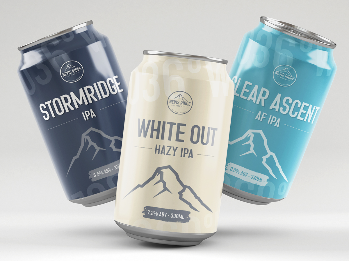
Nevis Ridge at Work
To show how this typeface works in practice, I created a branding concept for a craft brewery. The aim was to see how it holds its own across a full branding system – from the logo through to packaging. Its condensed proportions make it a great fit for cans and labels, where space is tight but impact still matters. The Clean style keeps things sharp and contemporary, while the Rough style could be used to add texture and character for a more weathered, craft-led feel.
If you’re looking for a condensed display font with confidence, character, and a touch of Highland atmosphere, Nevis Ridge brings the altitude.