
Some places leave a mark long after you’ve left them. For me, that place is Glen Etive – a wild, breathtaking glen in the Scottish Highlands, familiar from Skyfall, where Bond and M pause to take in the sweeping mountain views. Its vast, dramatic, and quietly powerful presence became the inspiration for my first typeface, capturing the spirit of the glen in every glyph.
From Landscape to Typeface
Glen Etive was the starting point for my first typeface at Thistle Type. As I drew each letter, I kept thinking about the rhythm of the landscape – the rise of the mountains, the sweep of the river, that quiet but dramatic presence the glen has.
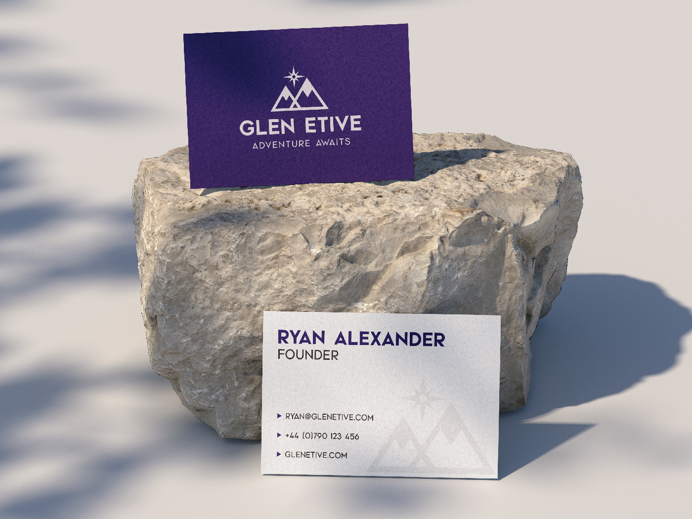
The result is a typeface that feels grounded yet expressive, working particularly well for titles and headings, logos, and branding that needs a touch of Scottish character.
Inspired by the Outdoors
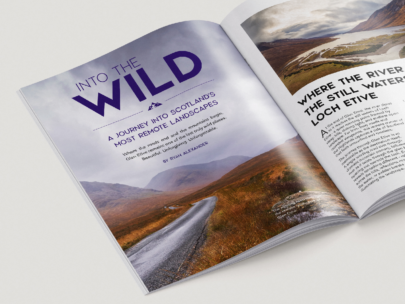
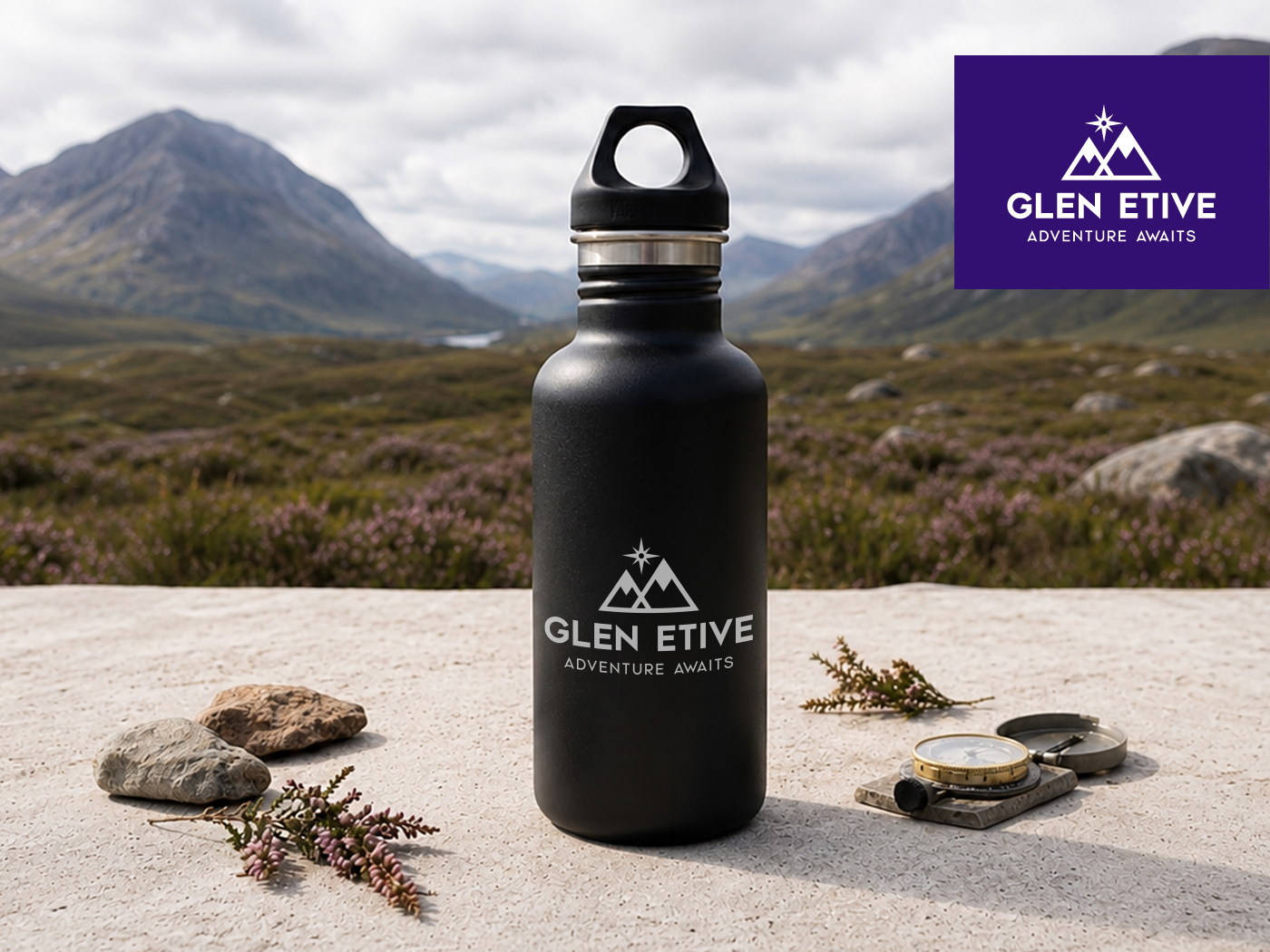
As I worked on the mockups for Glen Etive, I found myself naturally leaning into outdoor-inspired branding and editorial concepts. The typeface immediately felt at home in that world – whether on magazine spreads, adventure packaging, or branding for outdoor products.
I think a lot of that comes from the landscape behind it. Glen Etive has this quiet sense of scale and atmosphere that I wanted to capture in the letterforms. The result feels bold and confident, but still grounded and approachable.
What surprised me most was how versatile the font became once I started applying it across different ideas. In some settings it felt rugged and adventurous, while in others it took on a more refined editorial character. That balance gives it a subtle connection to Scotland without feeling overly themed, which makes it flexible across a wide range of creative work.
More Than a Font
Choosing Glen Etive means choosing more than a typeface. It’s a tribute to a landscape that inspires me, and the first step in a collection of typefaces shaped by Scotland’s landscapes, language, and spirit.